Mobile Ethnography White Paper
Learn how Mobile Ethnography can supplement your research projects and generate richer contextual insights for your brands.

Health insurance is one of the most important purchases we make in our lives. It is also one of the most expensive and complicated decisions we make.
With any number of providers offering similar services, it can be difficult to understand which plan offers the best cover for your family’s needs.
The post shares details on how a UX research agency used digital ethnography with mobile screen recording to get better insights for its insurance client.


Purchasing personal insurance can be complicated. With family insurance encompassing every member of the family and multiple generations, it can be almost impossible to understand what you need and how much you should be paying.
When our client approached us, they were in the process of designing a website for their client’s (an insurance provider) family health insurance offering.
In order to design a site that would capture users’ attention and quickly establish trust, they first needed to know what their target audience was looking for. In particular what were their motivations and why their current insurance provider was not satisfying their needs.
Having previously coinducted usability testing in a UX lab, their end client felt that the outputs of that research sprint were rushed and lacked the real world context in which health insurance decisions are really made.
They needed something more contextual and longitudinal that would (a) give them a deeper insight into the healthcare insurance purchase journey and (b) show them what the user experience was really like as families actually go through the process of choosing a healthcare insurance provider.
Our clients’ research objectives were to:
Use video tasking to bring their target persona to life for that the entire team.
Determine if their clients current family health insurance section of their website satisfied the requirements of their existing customers and how it could be optimized
Understand the motivations, needs and, expectations of families searching for a new family health insurance provider.
Gain an insight into how consumers researched, discovered and analyzed information relating to family health insurance online.
Understand what and who influenced the health insurance path to purchase
Understand consumers’ experience on competitors websites at a detailed level.
100 Respondents
26 Tasks
2 Weeks
Strategy: scheduled Tasking
Recruitment: Firstly, the client recruited respondents across several segments: new families purchasing healthcare insurance for the first time, existing customers, non customers who were unhappy with their current healthcare unsurance provider and non customers who were in the process of switching providers.
Respondents were sourced both from their internal CRM and through an independent qualitative research recruitment consultancy.

Working with Indeemo, our client designed a 2-week scheduled task list for all personas.
Week 1: focus on the human
During the first week of the study, the client took an exploratory approach to tasking and scheduled several open ended tasks designed to get to know the participants holistically.
Towards the end of the first week, our client incorporated a number of mobile screen-recording tasks into their digital ethnography study focused on understanding how their target personas searched at a category level.
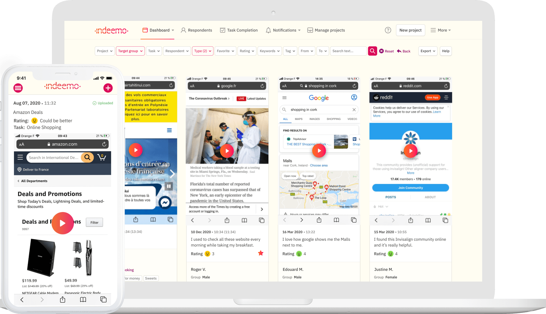
Using mobile screen-recordings, they could see how respondents browsed online for family health insurance, how they looked for a specific type of cover and how they researched online for content that would inform their purchasing decision.
Week 2: focus on the journey
During the second week of the study, our client dived deeper to further understand and map the user experience on both their own and competitors sites.
Again, using the Indeemo mobile screen recording feature, they tasked respondents with showing what they found positive or frustrating in their search for family health insurance.
Understanding this user experience provided a real-life, in context perspective of exactly how consumers behave online when searching for healthcare insurance cover. It also helped them map the journey at a very granular level.
Additionally, the mobile screen-recording function allowed our client to task respondents to record exactly how they navigated the client’s own website and this allowed them to capture media rich feedback which they were able to integrate in their design workshops.
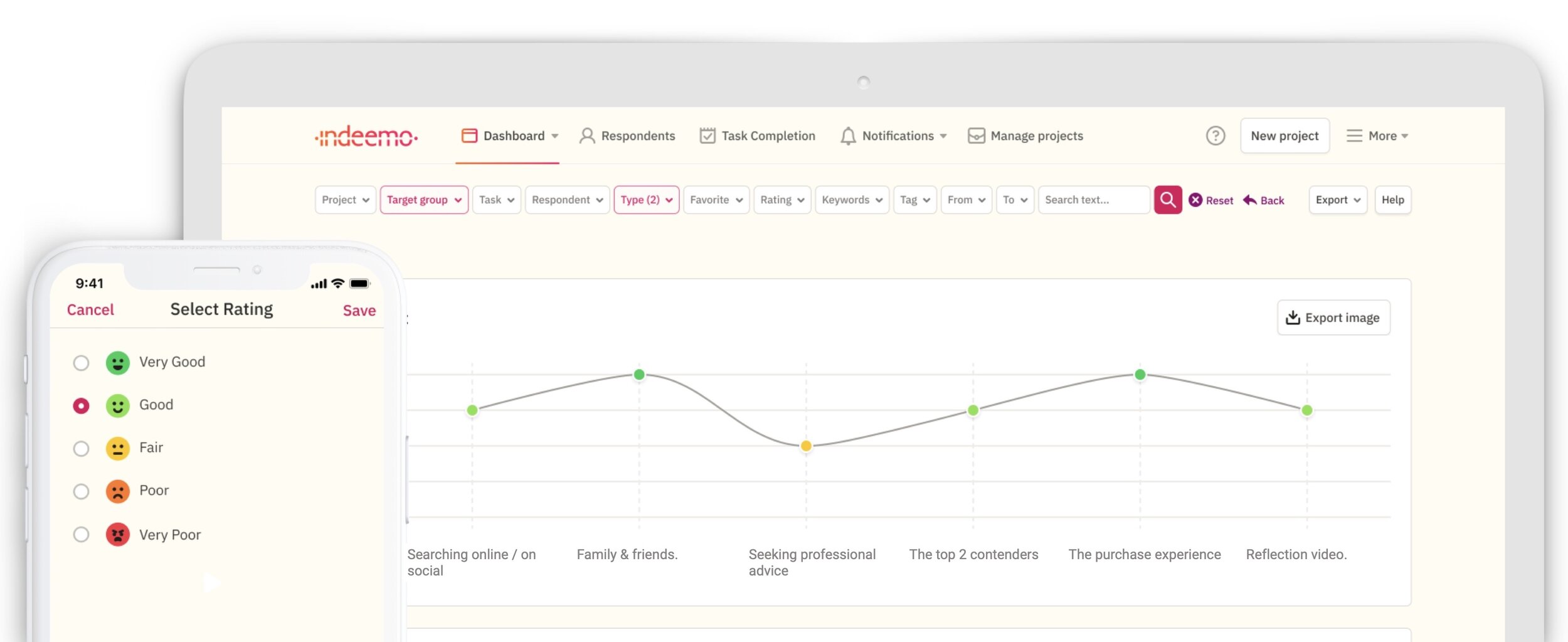
All of this media rich, experience data was seamlessly collated on the Indeemo researcher dashboard.
Observer logins were provided to the end client’s team so that all relevant design, marketing and development stakeholders could follow the fieldwork as it progressed. This enabled the UX researchers and the end client to “live” the research as it progressed and allowed an agile, collaborative partnership to develop.

The context rich data captured provided a rich, in-the-moment insight into the user experience of respondents on the client’s website. In a minefield of online insurance providers, this was a particularly valuable insight which allowed our client to understand exactly how their website needed to be optimised for mobile.
Furthermore, at the end of the 2 weeks, the UX research agency and the healthcare insurance client had amassed a large amount of behavioural and experience data. This enabled them to:
validate and fine tune their user personas
get a deeper understanding of the omni-channel path to purchase for healt insurance, particularly the messy middle between that trigger to switch and eventually choosing a provider
amass a wealth of video based mobile screen recordings that helped the design team better architect the information on their site and refine the user journeys for various personas e.g. the needs of switchers varied massively from those considering insurance for the first time.
prepare customer journey maps of the path to purchase for each user persona and use these to inform the future state design

If you’d like to learn more about how mobile screen-recording can help an insurance provider to understand consumers online behavior and experience, please get in touch.
Indeemo recognizes the significance of maintaining confidentiality and security in healthcare projects and with healthcare data. That's why we ensure compliance with relevant regulations such as HIPAA and GDPR and hold an ISO 27001 certification. To provide added privacy, Indeemo has implemented options for anonymous email communication and push notifications, allowing us to avoid storing any names or email addresses within our system.
GDPR Compliant
Information Security
Enterprise Ready
HIPAA & ISO 27001 Accredited
Digital Ethnography with Mobile Screen Recording is a quick, agile way to get a deeper understanding of your customers’ path to purchase.
It is an ideal supplement to Diary Studies, UX, Path-to-Purchase and Customer Journey research projects.
If you’d like to explore how Indeemo can support your next research project, please contact us.
Learn how Mobile Ethnography can supplement your research projects and generate richer contextual insights for your brands.


